
Businesses and organizations have become more and more focused on data that can be obtained from their customers and services. Almost everything, ranging from analyzing their target audience to the progress of each sale, is tracked.
This has led to the proliferation of data visualization tools. With these, users have been able to learn more from their intrinsic day-to-day transactions. Different statistics include company sales, daily site visits, and even their target and actual demographic. This suite of mind mapping software presents data with reader-friendly visuals and graphs and allows organizations to make the most of their data.

What Are the 20 Best Data Visualization Software Solutions of 2026?
People are naturally visual creatures. Human brains process images 60,000 times faster than text. And it won’t matter if your data is gathered and consolidated from multiple sources or if they are as precise to the millionth decimal place. If they are laid out in plain text or numerals, your audience will fail to grasp their significance unless they are presented and interpreted in a more visual way.
Data visualization software can help you show this data in a more approachable, visual form. It’s packed with tools that allow specialists or even regular businesspeople to integrate data from multiple sources to develop visual representations of large and complex data sets. Most of all, it extracts insights from the abstract realm of numbers to tell a story, driving the quality of decision-making up—a benefit that any business would find invaluable.
Top Benefits of Business Analytics
Improved Quality of Decisions: 82%
Improved Quality of Decisions
82%Enhanced Planning and Forecasting: 76%
Enhanced Planning and Forecasting
76%Consistent Data Across the Enterprise: 73%
Consistent Data Across the Enterprise
73%Increased Speed, Simplicity, and Ease of Use: 68%
Increased Speed, Simplicity, and Ease of Use
68%Increased Operational Efficiency: 67%
Increased Operational Efficiency
67%Source: Harvard Business Review 2017
Designed byIn today’s post, we present the 20 best data visualization applications of 2020. From business intelligence tools that can do all operations of data collection in one platform, lightweight solutions that dramatically cut down data processing time, and software that can unify multiple data streams into a single source of truth, this list has it all.
Top 20 Data Visualization Solutions
1. Sisense

Sisense is a business intelligence platform that lets you visualize the information you require to make better and more intelligent business decisions. It uses an agile analysis software with a full range of data visualizations. This way, you can create dashboards and graphical representations with a drag and drop user interface. You can also share them with colleagues, business partners, and clients via interactive dashboards.
We chose Sisense as the first on our list because it is a fast-paced, all-in-one tool that you can easily learn to use. Their package includes flexible company-based pricing, instant technical support and deployment, large-scale functionality without using any add-on features or purchases, real-time trends, and data tracking, and integration capabilities with any other Sisense products.
Sisense

Try out Sisense with their free demo
Why Select Sisense?
- Sisense In-Chip® Technology: Sisense is built from the ground-up so that it throws its operational demands to the CPU’s L1 cache. Compared to throwing a query to disk that takes a million cycles to process an operation, the L1 cache takes only three cycles—resulting in a lightning-fast operation, no matter the size of the data.
- Single-Stack™ approach. Sisense eliminates the multiple “stacks” that’s the norm for big data, which tends to make data analysis seem like an assembly line. Sisense collects, processes, and visualizes data all in one platform.
- Interactive, collaborative dashboards. Whether it is you or your co-workers, you can all collaborate and get the data you need. No more “gatekeeping” the data; data is freely shared to all stakeholders to interpret as they wish.
Detailed Sisense Review
2. Looker

Looker is a data visualization solution that helps businesses large and small make agile and timely decisions through an in-depth analysis of raw data for insights. It features a powerful business intelligence platform that lets users utilize SQL to organize unstructured data.
Furthermore, Looker uses popular data modeling language for impactful visualizations and seamless data consolidation. Users can also create reports instantly, gamify the data analytics journey, and present insights in compact visual aids. We highly recommend it for its ease of use, collaboration features, and custom visualizations.
Why Select Looker?
- Ease of use. Looker is easy to navigate thanks to an intuitive, well-designed interface and workflow. Users no longer have to fret about complex, advanced coding to clean, organize, and interpret unstructured data. It comes with self-service features that make for a simplified data analytics journey.
- Strong collaboration features. The software makes it easier to collaborate through its strong support for any browser and mobile device. Users can collaborate and discuss data anytime, anywhere. Reports and data can also be instantly generated and shared through emails as well as converted into more popular forms such as Google Docs or Excel.
- Handy and compact visualization. Workflows are packed in a single dashboard, which you can personalize according to your preferred settings and requirements. Workflows and processes can be easily managed, and novice users can create powerful reports through its Mapping module.
Detailed Looker Review
3. Zoho Analytics
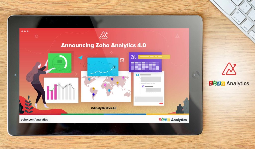
Zoho Analytics is a business data analytics platform that uses a variety of tools, which include KPI widgets, pivot tables, and tabular view components that enable it to generate reports that come with valuable business insights. The platform, formerly known as Zoho Reports, promotes collaboration, enabling users and their colleagues to work together in report development and decision-making.
To make things even better, the solution lets users embed just about any report or dashboard in their apps, websites, and blogs. The vendor makes its commitment to system security by using only state-of-the-art security measures, which include an encrypted connection. App developers and ISVs and developers can likewise benefit from using the software as it allows them to integrate and build reporting and analytical capabilities into their platforms. Zoho Analytics free trial allows you to get to know the features firsthand at no cost and without commitment.
We have decided to include Zoho Analytics as part of our top 20 data visualization software list because of its user-friendly dashboard, comprehensive pricing packages, highly secure online platform, and easy to upload data integration and accessibility.
Zoho Analytics

Try out Zoho Analytics with their free trial
Why Select Zoho Analytics?
- Insightful reports. It uses different components to generate reports that offer valuable insights for decision-making.
- Robust security. The solution uses top-of-the-line security measures that include connection encryption.
- Integration and app development. It allows ISVs and app developers to build and integrate reporting and analytical functionalities into their applications.
Detailed Zoho Analytics Review
4. Reveal
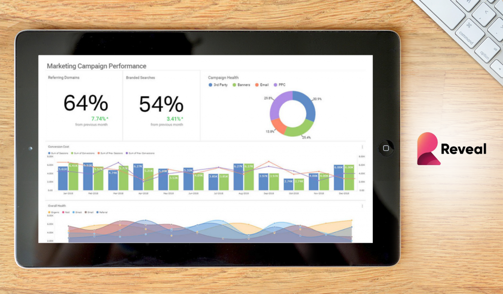
Reveal is a flexible, self-service Business Intelligence (BI) and data visualization software for businesses of different sizes. Primarily, the platform empowers businesses to create, modify, and share stunning data visualizations and expressive dashboards. This way, it enables users to interpret data and unearth business insights for evidence-based decision making.
Reveal gives businesses access to vital statistical functions such as time-series forecasting, regression analysis, and predictive analytics. Besides, it enables users to add and leverage machine learning models to data visualizations. The vendor has an appealing free trial where you can tinker with the features at no cost.
Why Select Reveal?
- Flexible architecture and rich APIs. Reveal embedded analytics is that it allows you to integrate data analytics right into your apps with ease. The best thing is that with its flexible architecture, the platform gives you unfettered control of your app’s features.
- Leverage machine learning models. Even better, the platform allows you to create, modify, and add machine learning models to data visualizations.
- Multi-device support. Moreover, Reveal is deployable everywhere including on-premises, in the cloud, web, desktop, and mobile devices.
Detailed Reveal Review
5. Periscope Data

Periscope Data is an advanced data analytics software that integrates all your data sources into one platform to perform powerful analysis and gain useful insights. It allows for secure sharing of data across the entire organization as well, complete with collaboration features such as annotations and real-time updates.
Furthermore, it empowers you and your teammates to understand your business analysis and performance with just a single glance. This is thanks to Periscope Data’s vast collection of different types of charts, maps, grids, and other tools that make visualization easier and more engaging.
Detailed Periscope Data Review
Why Select Periscope Data?
- Custom visualization. You can easily create customizable and interactive visualizations by utilizing its R packages or Python libraries to communicate your insights in a more effective fashion.
- Easy data discovery. Exploring data and building dashboards can be done in an instant without any need for coding.
- Powerful integration. You can combine every data source you are utilizing into this platform to get powerful analysis and useful insights. MYSQL, Oracle, and Salesforce are just a few of the native connectors that the system supports.
6. Tableau
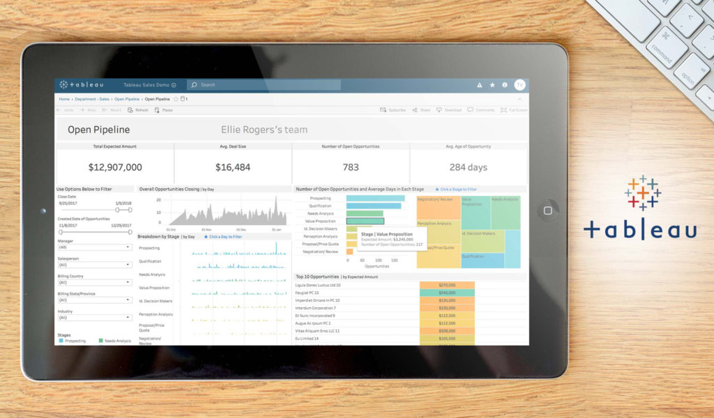
Tableau is a business intelligence system that takes a revolutionary approach to data analysis. It quickly connects, visualizes, and shares data with an efficient, seamless experience from desktop to mobile. You can create and publish dashboards, share them with colleagues, and analyze using different methods. We recommend it because of its simplified drag-and-drop system, all-day technical support, and flexible package fees.
Detailed Tableau Review
Why Select Tableau?
- Flexible data analysis methods. Depending on how you want it, you can choose from several approaches and create a unique data analysis system for your company.
- Mobile friendly. The application can transfer the data to any device, including mobile.
- Security permission access. To protect your information, you can set collaborators and other users to limited access. This way, they can focus on their own fields.
7. Domo

Domo is a great self-service business intelligence solution that focuses on social collaboration. It can give you real-time data in a single dashboard and uses creative data displays such as multi-part widgets, sparklines, and trend indicators to make things easier to understand. It comes with integration features for software like Google Analytics for better data aggregation. It also stands out thanks to its social sharing features, which include user-to-user messaging and data sharing.
Detailed Domo Review
Why Select Domo?
- Free trial. All its packages come with a free trial for you to test out and select the best match.
- Socialization. Domo comes with messaging, contextual data, and notifications to keep you and your contacts informed.
- Dashboard creation. You can create a custom dashboard to fit your functionalities and data.
8. Microsoft Power BI

Microsoft Power BI is a suite of business analytics tools that can turn data into understandable visuals, making it easier for you and your team to devise effective business strategies. It comes with unlimited access to on-site and in-cloud data to give you a centralized data access hub. It also comes with a robust tutorial system to help you learn how to use it properly.
Detailed Microsoft Power BI Review
Why Select Microsoft Power BI?
- Unlimited connective options. The system can blend with plenty of third-party software, making expansive integration possible.
- Affordability. Microsoft Power BI comes with a free and a pro package, which costs only $9.99. This makes it easy for any user to access the system.
- Web publishing. With this platform, you can import and publish data online for your collaborators.
9. QlikView
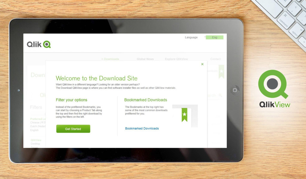
QlikView is a data discovery product that lets users simulate the application of analytical data. It also allows users to create/utilize default and custom data connectors and templates, depending on your needs. We added it to the top 20 data visualization software because of its global data search, role-based user control, and consistent data reporting templates.
Detailed QlikView Review
Why Select Qlikview?
- Personalized data search. You can modify the data search and analysis from the visuals to the labels to fit your needs.
- Script building. You can build your own applications from the software script to fit your own needs.
- Role-based access. You can assign users and collaborators to specific security and data access.
10. Klipfolio
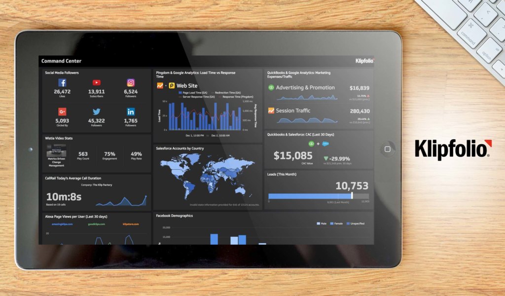
Klipfolio is a cloud-based business intelligence tool with real-time accuracy. The software is connected to over 500 data sources, including web-based services such as Google Analytics, social media platforms like Moz and Twitter, and on-premise data warehouses. With it, you can create customizable dashboards or use built-in templates. You can also integrate with data sources for in-depth analysis in several areas.
Detailed Klipfolio Review
Why Select Klipfolio?
- Data sourcing. With over 500 data sources, you can analyze your data using any possible area you deem necessary.
- Financial forecasting. You can use the data analyzed to make predictions for future business plans and possible trends.
- Customization. You can modify the dashboard and reporting templates to fit your tastes.
11. IBM Watson Analytics

IBM Watson Analytics is a business intelligence application that lets you build custom dashboards with a few clicks. You can type in various questions for the intelligence software to answer your needs. Also, you may choose from a list of templates to create visuals.
It comes in three separate packages to suit the different needs of its clients, from small-scale businesses to enterprises. However, only the professional package lets more than one user access it.
Why Select IBM Watson Analytics?
- File Upload. Depending on what package you choose, you can upload up to 10 GB of data to share with your collaborators.
- Public forum support. For technical support, you can access the community forum to find the quickest and easiest solutions from other users.
- On-site data. You can access the data on-premises or through the cloud.
12. MATLAB

MATLAB is a detailed data analysis program useful to those with limited and widespread technical knowledge. It can assess signals from multiple data sources for real-time updates. It also has an easy-to-use interface and graphical design options to give you the best looking visuals.
Detailed MATLAB Review
Why Select MATLAB?
- Graphical tools. Designed for any image or video, you can create the visuals you want without hassle.
- Multiple data sources. You can collect data from multiple sources online, from your website to other analytics programs.
- Scaleable changes. You can modify the algorithm to find the right analysis with minimal changes to the program itself.
13. SAP Analytics Cloud
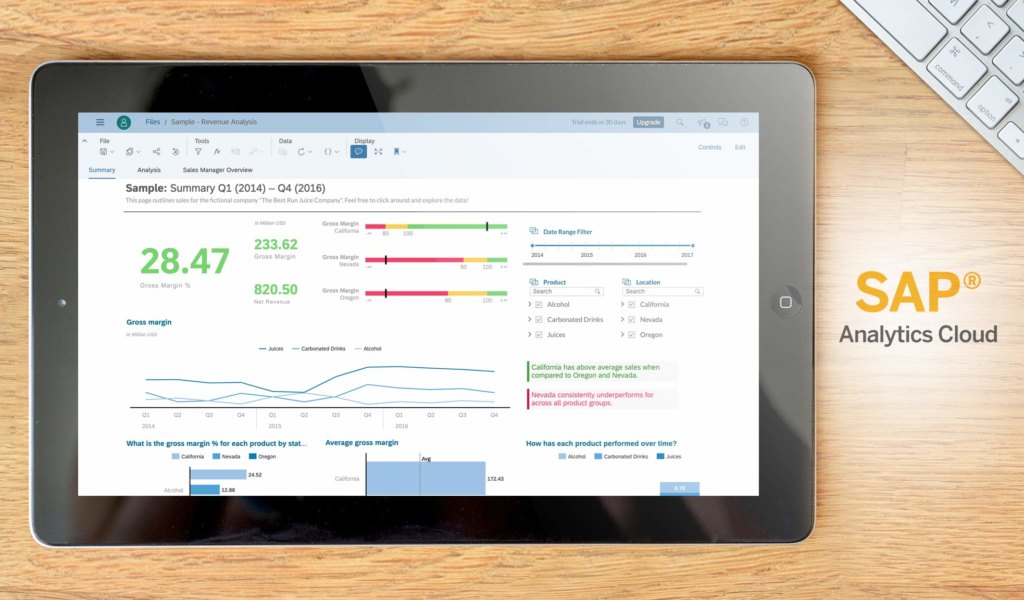
SAP Analytics Cloud is a business intelligence application with real-time analytics and events management. You can generate focused reports and collaborative tools for online discussion. It also comes with import and export features for your spreadsheets and visuals.
Detailed SAP PLM Review
Why Select SAP Analytics Cloud?
- Forecasting. You can use real-time analytics to forecast your next sales or business strategy.
- Events. You can set up important events and processes to set up for your coworkers.
- Cloud-based protection. The SAP security options ensure on-premise and cloud-based safety for your information.
14. Kibana
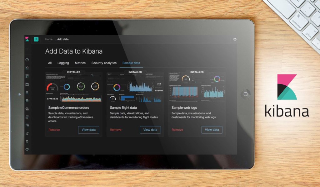
Kibana is a data visualization and analysis program. It uses a unique feature called Elastic Stack, in which you can observe different data sources for a comprehensive report. It also comes with unique factors like time-series and user action for your convenience. You can even detect anomalies and trends with the graphical system. We added it to our top 20 data visualization software thanks to its cross-analysis and anomaly detection software.
Detailed Kibana Review
Why Select Kibana?
- Anomaly detection. You can spot discrepancies and fallacies in your data analysis.
- Relationship analysis. You can discover the relationships between factors in your data sources, both common and uncommon.
- URL embedding. Along with dashboard sharing, you can embed URLs to share among your colleagues.
15. Plotly
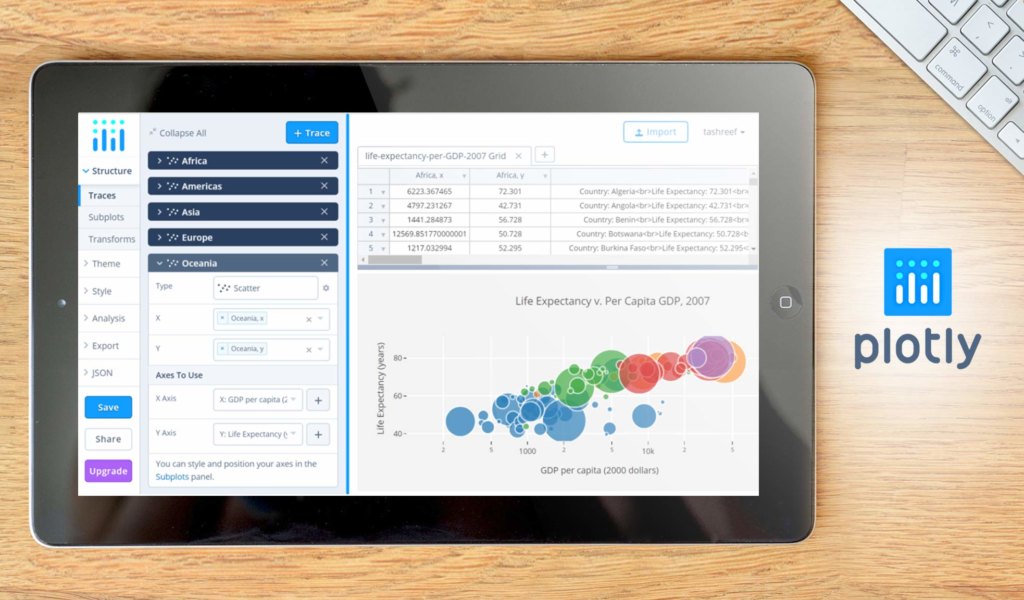
Plotly is an advanced, online data visualization program with a colorful design. You can use the chart studio to create web-based reporting templates. You can also modify your own dashboards and interactive graphs for your collaborators to comprehend better.
Detailed Plotly Review
Why Select Plotly?
- Chart options. You can choose between 2D and 3D charts for maximum comprehension.
- Open source coding. You can modify the script to create your own programs or features.
- Designer input. After creating your templates, you can have a designer clean it up.
16. Chartio
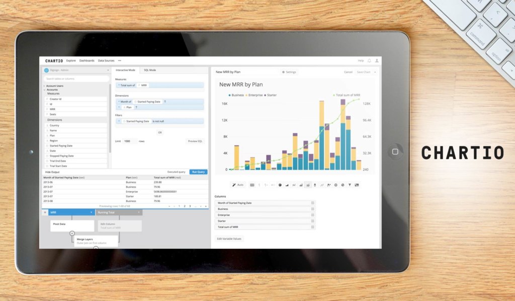
Chartio is a powerful business intelligence tool that is useful for businesses of all sizes. You can analyze data in real-time and change it, thanks to the drag-and-drop interface. It also comes with comparative analysis and various chart formats.
Detailed Chartio Review
Why Select Chartio?
- Comparative analytics. You can select data from two or more sources and compare the results to find any discrepancies.
- Simplified set-up. With the drag-and-drop interface, you can setup and learn the system quickly.
- Quote-based pricing. You can buy the platform with a price unique to your company and its needs.
17. Infogram
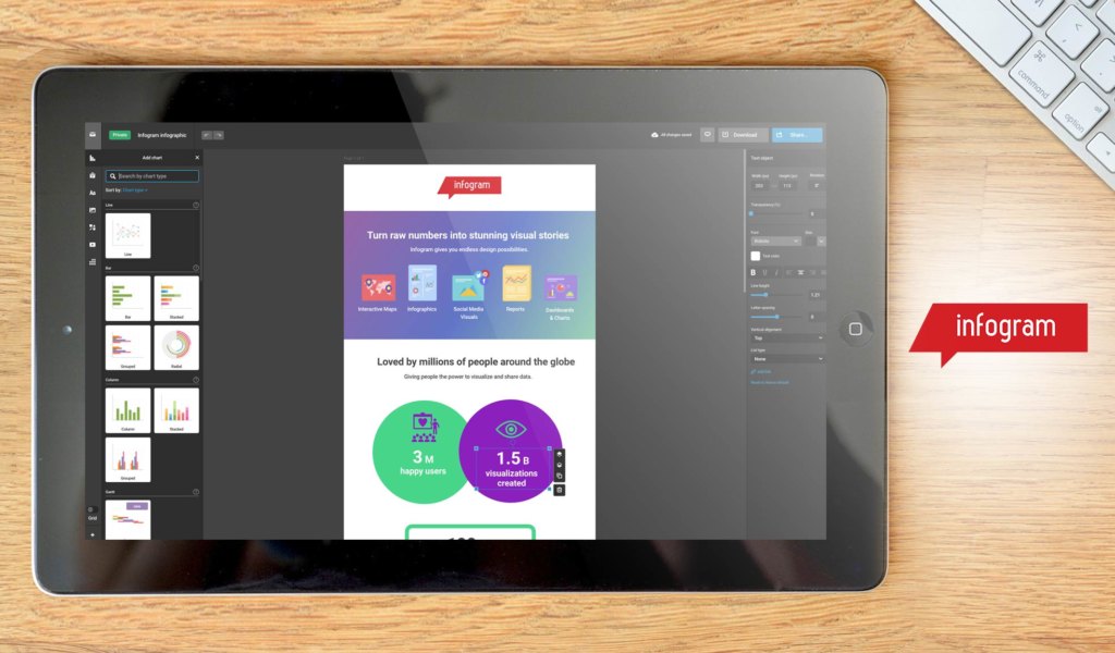
Infogram is a data visualization solution designed for corporate leaders and media companies, among others. It comes with 20 ready-made templates for reports. You can also add interesting images for your reports, including royalty-free icons, GIFs, and photos. It also has an intuitive drag-and-drop editor.
Detailed Infogram Review
Why Select Infogram?
- Download format. You can download your reports in various images and GIFs, among other formats.
- Ready-made templates. You can choose one of over 20 professionally-designed report templates.
- Dedicated account manager. You can also get an account manager to help you run the analysis site.
18. Highcharts
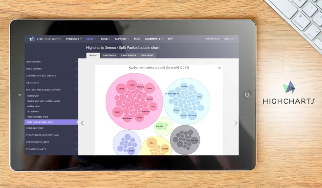
Highcharts is a charting solution made of pure Javascript. It has a simplified interface and can integrate several charts to websites. You can choose from a myriad of chart formats, from bubble to waterfall to column. It is free for non-commercial uses, but charges for any commercial applications.
Detailed Highcharts Review
Why Select Highcharts?
- Mobile and desktop compatibility. You can transfer and collect data on your computer or your mobile devices.
- Native browser use. You can use the solution on any browser without the need for Flash, Java, or other installations.
- Premium support. You can order premium support for your corporation.
19. Visme
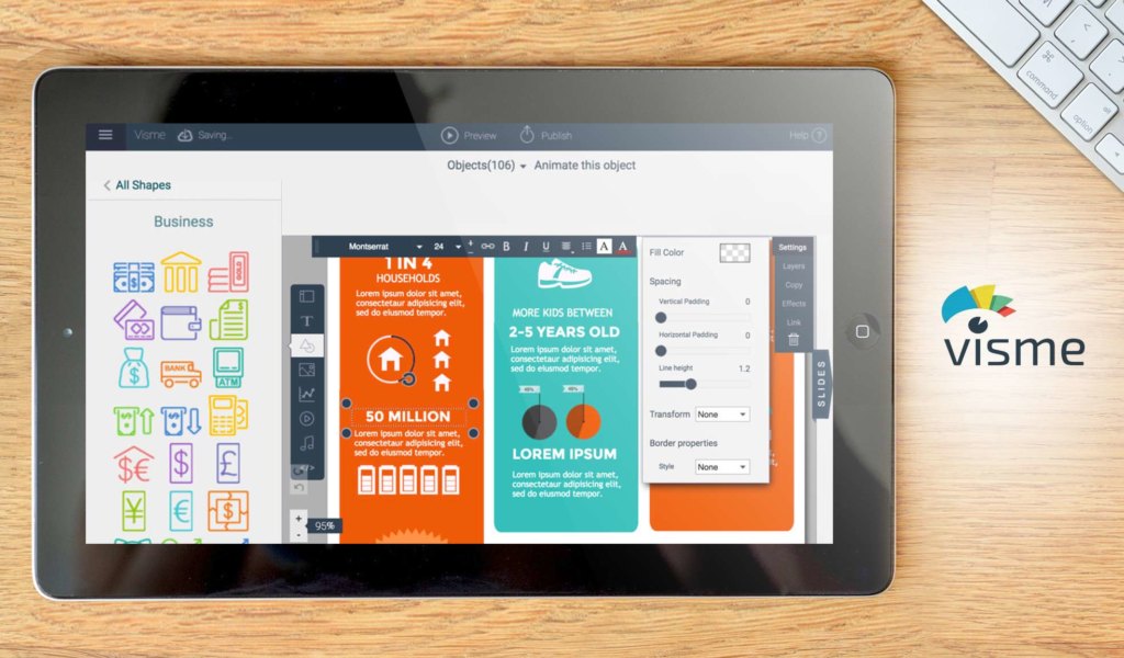
Visme is a data presentation and visualization tool useful for generating compelling data reports. With it, you have a wide variety of presentation tools and templates for a unique design. You can also use several other customization tools based on data from downloaded materials, published sites, and social media platforms.
Detailed Visme Review
Why Select Visme?
- Content database. You can create several designs and templates and save them for future use.
- Collaborative interface. You have several links and data sources to connect to, for you and your collaborators.
- Microsoft Office integration. You can integrate all the data into any Microsoft Office application.
20. Geckoboard
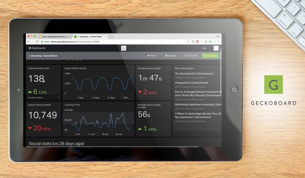
Geckoboard is a data visualization tool for collecting and sharing your data. You can choose from over 80 pre-built different services for real-time analysis. The platform also gives you an API for custom widgets and branding options.
Detailed Geckoboard Review
Why Select Geckoboard?
- Custom branding. You can add your own logo and completely personalize the data and dashboard.
- 80+ integrations. You can share your data with several platforms, including Google Analytics and Salesforce.
- Metric emphasis. You can choose which metrics are the focus of each of your reports.
Why Visualize Your Data?
Data is, at best, an abstract figure and is only as good as how it’s interpreted. Data visualization, therefore, can help you make sense of it and translate it into actionable information. At this stage, data can become useful. You can then create a strategy to leverage what you have learned from that information and, ultimately, from what data you’ve gathered. A reliable business process management software (BPM) can make this part of the journey even easier.
While any of our top 20 picks can give you the visuals that you require to run your business intelligently, Sisense is the most well-rounded and feature-rich. What’s more, it can present you with comprehensive reports and easily digestible visual representations. If you want to know more about the features you can easily request for Sisense free demo.
That said, no matter how great an app can represent data is limited by the data the software can harvest. In that case, looking at our list of business intelligence solutions can serve these purposes well.


Leave a comment!